Show me the information
Since I'm in an unhinged rant frame of mind I wanted to also rant about this tendency for 'minimalist' thinking in UX/UI. I'm going to blame Google and their Material UI for this, they should be blamed for most things, but the trend has become something of an accepted wisdom amongst UI designers.
The idea is you keep the UI nice and 'clean' and only show the user the fields you believe are relevant to them. For example you truncate a message because it would wrap and break the UI scaling. Or you show just the date part of a timestamp, or even worse show "a few hours ago" instead of the actual date. Maybe you show the full time on a mouse-over event, but how do I copy that?
Hiding information to make your site visually appealing breaks real-world tasks. You can't predict what the user is going to do, you are not an oracle, so just show them the information. Even if they decide to put the entire text of the Iliad in a description field. It'll look garbage but at least they can complete their task.
There is a lack of empathy for the user in these choices. What is your user trying to achieve? How can you make that task as easy as possible? What about users who fall outside the flows you predicted they would need?
First up there's this screenshot from the fundamentally cursed Gmail UI:
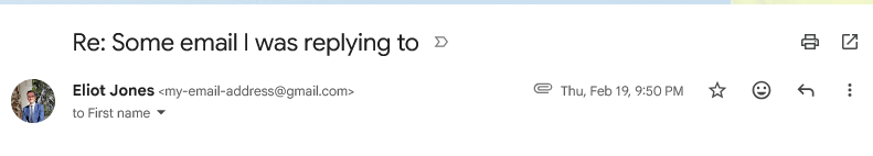
I've redacted my personal information from the screenshot but the To field only tells you the first name of the recipient. What if you have multiple recipients with that name? Why not show me the email address next to the name? I needed to double check the address because I was sending an email from a different device outside of the Gmail ecosystem. You can get to the email address by clicking the expanding chevron next to the name but this is another speedbump on a common task. You tell me my own email address just above, why not the recipient's? Well it would scale badly for multiple recipients, but that's your job as a designer. Don't just hide the damned information. Systems should be designed to do things.
Then the worst offender. My bank. I was sending money abroad for some purpose using a wire transfer. The bank listed 2 options for the recipient bank that differed only in the last 3 letters of the SWIFT code. The recipient name, address, account number, etc., was identical. Because the first small test transfer I sent opted for the wrong SWIFT code leading my money to disappear I had to try again with the second SWIFT code. The second transfer worked so then I needed to send the remaining payment amount. But because of the idiotic decision to hide the full payee details I couldn't actually tell which of the 2 existing payees was the right one, so I then had to add the details a 3rd time. That left me with this problem:
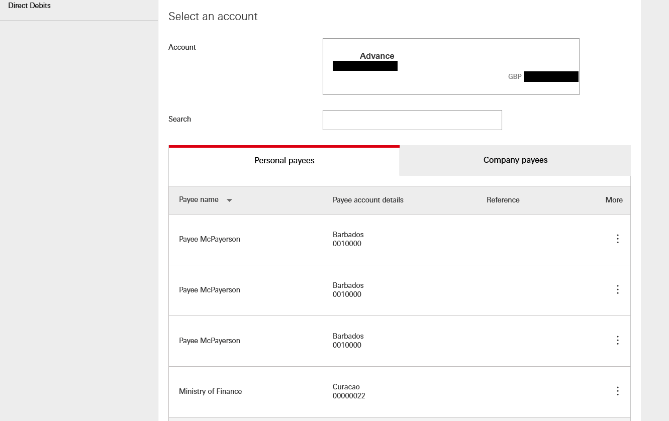
Again I've redacted information here, these aren't real account numbers or names but I kept the redaction consistent. As you can see there's 3 payees with completely identical listings. If I send money to one of these my money disappears forever, lost somewhere in the international wire system. Well, you think, they've probably just done an inconvenient information hiding thing again. Maybe just click click the 3 dots next to the payee and you'll see the full details?
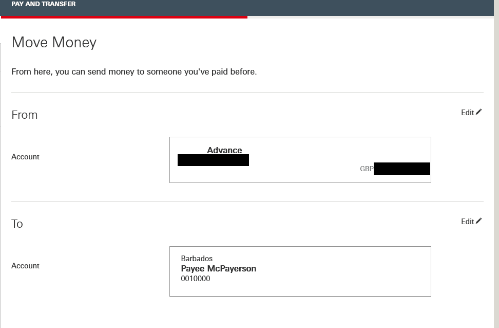
Nope, the only options there are to delete the payee or send a payment. If you try sending a payment there's no further information about who you are actually paying.
Granted this is a bank UI so their systems are probably ancient and they don't have the time or software development resources to go in and add a way to retrieve the information like Google has. But this happens because the designer and their poor taste wins out over the needs of people who actually use the systems they build. I'm sorry that the information density or length or shape is inconvenient to your artistic vision. You're wasting my time and potentially losing me money. Just add the damned fields to the UI. You have them, they're in your database somewhere. So show them to me!
Modern UI design is cursed. People with good aesthetic taste but terrible taste in actual usage win out over the developers and users of systems all the time. There is a lack of empathy. I feel like the only reasonable person in a world gone mad.